Northman Tutorial - Photoshop CS2
Jun. 11th, 2009 11:08 pmIn this tutorial I am going to show you how to do the techniques I used in my "Northman header".
Click the thumbnail to see the header in my personal journal

This tutorial is intended for beginners, so that you may learn how to use more advanced tools and do more advanced techniques in Photoshop CS2. If you already know how to use the tools then you can skip the How to parts in the tutorial.
I don't think it will be translatable to other programs, but it is probably translatable to other versions of Photoshop. Some of the tools may be in different places on your program though, but as long as you have them you should be able to do this.
This tutorial is for my "Northman header" as I mentioned above. (I'm sorry, but my header IS NOT up for grabs, nor is any part of it. I know I can't really prevent people from taking it, but please don't. Please make your own. That's why I'm writing this tutorial, so that you can learn the tools and use YOUR OWN CREATIVITY to make YOUR OWN HEADER.
Please do not copy exactly what I have done. Feel free to use the same textures, but please experiment with other images. Well, the pic of Eric Northman is not mine, so if you have it then you can use it of course.
Techniques and tools explained:
Blending, Magic Wand Tool, Polygonal Lasso Tool, Feather tool, horizontal type mask tool, Add Layer Mask, Making brushes, adding text, Desaturating an image, Eyedropper Tool and many more.
This is really in-depth and long long long so please be sure you have some time to spare. All of the images and examples in the tutorial are linked. If they weren't this would just be crazy. Crazier than it already is. I encourage you to click on the links to see the examples, they will help you alot. Also, everything in this tutorial is optional. Basically I am just showing you how to do the different techniques and how to use the tools. It's up to you which of them you use in the graphic you make and how you use them.
Ok, take a deep breath and let's get started.
NORTHMAN HEADER TUTORIAL
Feel free to click on the link cut to the technique you want to learn
Preparation - New File and Image Preparation
First decide what size you want your header to be. Since I have a rather large widescreen monitor and I just like large headers I made my file 1100x400 pixels. Click on "File", then "new" in the drop down menu. Make your settings like the ones in this image. Change the "Width" and "Height" to suit your needs.
Next choose the main images you would like to use on your header. Use the highest quality images you can possibly find when making large graphics. You don't want any blurriness or pixelation.
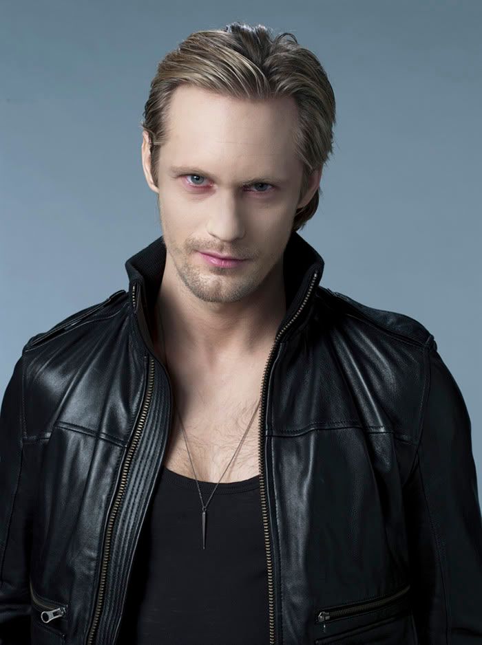
I chose one of my own photographs of the beach and this cast photo of Alexander Skarsgard as Eric Northman that has been reduced to the size I want to use on my header.
You can prepare and color and tweek your images however you would like. I used "Selective Coloring" on both my images (See the difference here and here).
For this tutorial, I'm skipping what settings I used in "selective coloring" because you will be using different images and will probably want a different coloring, so my "Selective Coloring" settings will not work on your images. Besides, this tutorial is not about using that particular tool. You can find tons of tutorials on how to use "Selective Color" at![[livejournal.com profile]](https://www.dreamwidth.org/img/external/lj-community.gif) icon_tutorial or coloring_help.
icon_tutorial or coloring_help.
When you have finished prepping your image, save it as a .psd, then flatten it and save it as a .jpg and you are ready to move on. I'm setting the beach image aside for now. I'll be using that later.
*I wanted a different background for my header, so for the pic of Eric I cut the background out. Since it's a solid background I used the "Magic Wand Tool". (Note: This will only work well for backgrounds that ARE a solid color.)
How to use the Magic Wand Tool:
1. Be sure your "Layers Palette" is showing. Go to "Window" and make sure there is a check mark next to "Layers" in the drop down menu. If there is not, click on it and your "Layers Palette" will appear.
2. Since you can't alter your background layer in your "Layers Palette" you need to make a duplicate of it. In the "Layers Palette" click and hold down the left mouse button over the background layer and drag it down to the little square that looks like a piece of paper. Duplicate Layer example
3. Click the eye next to your background image to turn off that layer.
4. Now make sure your duplicate layer is selected (highlighted blue).
Click on the Magic Wand Tool to select it.
5. I have the "tolerance" set to 20. But you can adjust it to suit your needs. (The tolerance determines how sharp your feathered edges are.)
6. On your image click on the background you want to get rid of. The selected area will look like it has marching ants surrounding it. It will look like this
7. Tap the "delete key" on your keyboard and the selected area will disappear.
8. Now your image should look like this. Gray and White checkerboard
9. Ctrl + D to get rid of the marching ant selection.
10. Repeat steps 4 through 9 as many times as you need to get rid of the rest of the blue background. Use the Eraser Tool to erase any stray bits of blue.
11. Now drag your Eric cut-out onto the blank image file you created and position it where you want it.
Example of Eric cut-out on the blank file
You'll probably notice that there is still some blue around his hair. I'm not too worried about this right now because I don't think it will show when I'm finished.
*Next decide what your background is going to be. I chose this paper texture by![[livejournal.com profile]](https://www.dreamwidth.org/img/external/lj-userinfo.gif) mrs7 and sandwiched it between the white background and Eric. Position it where you want it and desaturate it a little. (the only reason I desaturated the paper texture is because I am trying to stick to a color scheme. I only want blues, greens,turquoises, black and whites in the header. Skin tones are fine, but I am avoiding yellow.)
mrs7 and sandwiched it between the white background and Eric. Position it where you want it and desaturate it a little. (the only reason I desaturated the paper texture is because I am trying to stick to a color scheme. I only want blues, greens,turquoises, black and whites in the header. Skin tones are fine, but I am avoiding yellow.)
a. Make sure the white background on the header is selected (highlighted blue) in the Layers Palette.
b. Open the paper texture in Photoshop and make sure it's selected.
c. Click on the Move Tool.
d. Click and hold down the left mouse on the paper texture and drag it onto the header.
e. Now you can move it around and position it where you want it.
How to desaturate an image:
f. To desaturate your paper texture make sure the layer is selected in the "Layers Palette".
g. Click on "Image", hover over "adjustments", when the drop down menu appears click on "hue/saturation".
h. In the "hue/saturation" window click on the saturation slide and slide it to the left. I set mine to about -62. This part is optional. You do not have to desaturate your background.
Example of the image with the paper texture background
*Now we can pull the beach photo back out, or whatever image you are using. Oepn it up in Photoshop and make sure it's selected. Use the Move Tool to drag it onto your image between the paper texture and your cut out of Eric. Like this
I don't want the hard lines of a picture, so I am going to use the feather tool to make the beach scene look like part of it is covered by the paper texture background.
How to use Feather with the Polygonal Lasso Tool:
1. Make sure the beach image is selected in the Layers Palette. (Make sure you have the correct one selected. Click and hold the mouse button on the PLT till the drop down menu appears and click on the correct tool.)
2. Click on the Polygonal Lasso Tool
3. Click on the beach image with the "Polygonal Lasso Tool" and make a selection of the area you want to keep. (The PLT is a little tricky. Each time you make a turn you need to click the left mouse button. Just practice till you get it right and get the selection you want. The selection needs to end exactly where it started) Like this Pretend there is a dotted line on the edges of the header. The selection should be enclosed.
4. Click on "Select", then in the drop down menu click on "Inverse".
5. Click on "Select" again, in the drop down menu click on "Feather", in the window that pops up set the "feather radius" to about 20 pixels. Your selection will smooth out.
6. Tap the "delete" key on your keyboard.
Memorize these steps because you are going to use them over and over in this tutorial. This is one of my favorite ways to get a natural looking faded effect and blended effect on edges.
This is how it looks with the feathered selection still showing and the selected area deleted.
*Next we are going to add some more texture behind Eric. Open this texture bychamberten and drag it on to your image behind Eric. Duplicate the image in your layers pallette.
Click on the Move Tool. Make sure the texture layer you want to work on is selected in the Layers Palette. Position the textures behind Eric so that they are flowing from the upper right corner and down at an angle behind Eric's right shoulder.
Looks like this
Follow steps 2 through 6 under How to use Feather with the Polygonal Lasso Tool on each of the two layers of textures. Be sure you have the texture you want to edit selected in the layers palette.
This is how my textures look after I "Feather" them. Click to see example
You want to get rid of the hard edges and make your textures look like they gradually fade into the paper texture and other textures you will be adding later.
Are you still with me? :)
No? Take a break. Do-de-do de-do-de-do
OK. Better?
*Next we are going to take this texture bymozart and drag it onto our image. Put it behind Eric and in front of the swirly green and brown textures you just "Feathered". Like this Set the Blend Mode to "Multiply". Mask out the parts of the texture you don't want.
How to change the Blend Mode:
a. Make sure the texture is selected in your layers palette.
b. Click on the down arrow next to the word "normal" in your layers palette.
c. In the drop down menu that appears click on "multiply".
d. Leave the "Opacity" at 100%
You image should look like this now.
Next we are going to use "Add Vector Mask" on the texture you just added and get rid of the parts you don't want.
How to use Add Vector Mask
Look over this image before reading the instructions.
Example - Add Vector Mask
e. Click on "Add Vector Mask". It's a gray box with a white circle in it at the bottom of your Layers Palette.
f. A white box will appear in the Layer Palette next to your texture. Click on the white box to make sure it's active.
g. In your Tool Palette your foreground color should be black and your background color should be white. If the big boxes are not black and white click on the little black and white boxes next to them. Click on the curved double arrow to switch the black from the background to the foreground if you need to.
h. Click on the Brush Tool to select it.
i. Click on the down arrow next to the word "brush" near the top of your screen. Example image
j. Choose a soft round brush. I chose the soft round 65 px brush and kept the opacity at 100%.
(Note: in Mask the "Brush Tool" and the "Erase Tool" work the opposite of how they normally work. This is a bit confusing at first, but you'll get used to it.)
k. Using your brush run it over the parts of the texture you don't want showing. If you make a mistake switch to the Erase Tool, choose the same size brush and run it over the parts you just masked out. They will come back. This is the beauty of the "Add Vector Mask". If, later on you decide that you got rid of something that you want back, it's very easy to correct. This is something you will have to experiment with to fully understand how it works.
*I think the next most interesting element to work on is the Lion. I wanted something to fill in that area by Eric's right shoulder. I experimented with several things and finally decided the Lion looked really cool and would fit in great with some of the other elements I'm going to add later.
The Lion
I took this image(It's huge) bymozart and set it as a brush.
How to set an image as a brush and use it:
1. Open the image in Photoshop and make sure it's selected.
2. Click on "Edit", in the drop down menu click on "Define Brush Preset".
3. The image will now be a brush in your brush palette.
Next you'll want to choose a color to use for the brush, that matches the colors in your header.
4. Click on the Eyedropper Tool.
5. Go to your header and click the tip of the "Eyedropper Tool" over a color you would like to use. I chose a color from Eric's right eye #435862. It's a dark greyish blue.
6. Creat a new blank layer, at the top of your image, by clicking on the "square with the corner folded". You can find it next to the little trash can at the bottom of your Layers Palette.
7. Make sure the new layer is selected. (highlighted blue)
8. Click on the Brush Tool
9. Click the down arrow next to the word "Brush" near the top of your screen.
10. Find the brush you made and select it by clicking on it.
11. Stamp the brush onto your image making sure that the part with the lion is on it. You might have to stretch your paletter to get the brush to stamp correctly.
It will look something like this. Doesn't look so good, but we are going to fix it.
12. Select the Move Tool
13. Click and hold down the mouse button on the layer with the brush on it.
14. Drag the layer down your palette till it is just above the beach image.
15. Now move the brush around till you have it positioned where you want it.
This is how I positioned it
16. Use the instructions "e" through"k" for How to use Add Vector Mask to get rid of the parts of the brush you do not want. Choose a smaller brush for this part since you are dealing with smaller details.
My image looks like this when I am done getting rid of the parts of the brush I don't want.
*Alright, our header is really starting to take shape. Let's do something simple this time. I wanted something hanging down from the upper left corner of the header. Open this huge medalion image bymozart in Photoshop.
Follow steps 1 through 3 on How to set an image as a brush then come back here.
Make sure your foreground color is black. Create a new layer at the top of the header. Find the brush you made in your Brush Palette and click on it to select it. Stamp the brush on the header. Now you can use the Move Tool to move it around on your header. Position it so that just a small part of the brush is showing in the upper left corner.
Medalion brush before it's moved
Medalion brush after it's moved
That was easy enough. On to something more tedious, but totally worth the effort.
*We are going to put some text next to the right side of Eric's head. You can do this one of several ways. Type the text yourself, which is what I did. Use a text brush, but then it won't be personal. Or use a texture that is hand written text(usually not legible), which is a good option.
I used the lyrics from one of my favorite songs - "Tornado Song" - by one of my favorite local Celtic bands "Clandestine".
How to add text to your image
a. Click on the Type Tool to select it.
(Note: I always pick my font from the drop down menu at the top of the screen because you can see what the fonts look like.
Before we go further, take a look at this image because it will be much easier to understand my instructions. Example graphic.
b. Pick a font that you like and that fits the theme of the graphic you are making. I've chosen "Artists Script" because I think it ties in with the other elements in the header. I've chosen 24 pt for the size and left the anti-alias set to sharp.
(Note: When you are putting text on a graphic please make certain that you use the correct anti-alias for the font you are using. Blurry fuzzy text is a big no-no and very unsightly.)
c. Create a new layer just below the Eric layer and make sure it's selected.
d. Click on the header and a cursor will appear.
e. Start typing the text to the song or quote or whatever it is you are putting on the header.
f. Type each sentence on a separate layer. Like this
g. Click on your Move Tool.
h. In the layer palette, select the text layer you want to move.
i. Click on the text in the header and hold down the mouse button.
j. Move the text to where you want it. (In this example, I've moved one line of text up, so that it is positioned at the top of the header next to Eric's head.)
k. Keep moving each line of text over by Eric's head. Position the lines of text in a pleasing manner.
l. Set the blend mode on each line of text to "Multiply". This is optional. You can experiment with the blend modes on your text or just leave it at "normal".
m. I didn't want my text to over power my header, so I lowered the "Opacity" on the text layers to 40%. Now your text looks gray.
Example of header with text
I know this text part is tedious, but it looks so much better than just hitting the return to go to a new line.
* Now I want to show you how I did the text for my user name.
On your header create a new layer and pick a nice color from one of the images on your header by using the Eyedropper Tool. I picked a turquoise color from my beach image.
Now choose a font. I chose the font "Ibleum", set at 60 pt, with the anti-alias set to sharp. Be sure the new layer you created is selected. Click on your header. When the cursor appears type your user name or whatever it is you want to type. Use the Move Tool to position your text where you want it on the header.
Now I am going to show you how I made the stripey part of my user name that is sitting on top of the solid colored text.
How to use the "Horizontal Type Mask Tool"
1. Open the image, you used on the left side of the header, in Photoshop. In my case it's the beach image.
2. Make a duplicate of your image in the layers palette.
3. Click the eye on the background in the layers palette to hide it.
4. Make sure the duplicate layer is selected in your layers palette.
5. Click on the Type Tool and hold the mouse button down until the drop down menu appears with the other type tools. Click on the Horizontal Type Mask Tool.
6. Make sure you still have the same font and setting selected that you used before when you typed your user name on the header. (Mine: font "Ibleum", set at 60 pt, with the anti-alias set to sharp)
Please review this image of steps 7 through 12 before going on. It will help you understand what is happening.
7. Click on the beach image so that your cursor is positioned on the horizon. It will turn red/pinkish, so don't be alarmed.
8. Type your text. (If you don't get the cursor exactly where you want it I've found the easiest thing to do is click on the "Move Tool" and the cursor and pink will disappear, then click back on the type tool and you can try again.)
9. When you have finished typing your text click on the layer in your layers palette. You will see the marching ants around the text you just typed.
10. Click on "Select", then in the drop down menu click on "Inverse".
11. Tap the "delete" key on your keyboard.
12. Click on "Select", then in the drop down menu click on "deselect". Or you can ctrl + d on your keyboard.
13. Click on the Move Tool in your Tools Palette to select it.
14. Click and hold down the mouse button on the text you made.
15. Drag it onto the header above the text layer you typed earlier. example - now it's on the header
16. Use the Move Tool to position the text slightly to the left of the text you typed earlier.
17. Duplicate the layer and set it to "screen" at 50% Opacity.
Now it looks like this Surprise! :)
*To finish up the header I added a few more textures.
Old Norse Manuscript
I used this Old Norse manuscript that I found at UCLA's Catalogue of Digitized Medieval Manuscripts. This is just the coolest web site. Many thanks tomorwen_peredhil for pointing it out.
Since I don't want anything yellow on the header, the first thing I did is desaturate the manuscript. Follow the instructions under How to desaturate an image. Slide the "Saturation" slider all the way to the left at -100.
Use the Move Tool to drag the manuscript onto the header and position it beneath Eric and the scrolly textures on "his" left side, which is the far right side of the header. Set the blend mode to "Hard Light" at 100% Opacity.
Looks like this
Of course, I have no idea what the manuscript says, but it doesn't matter because I doubt there are many people in the world who can read it. It's very cool though isn't it?
Add some smokey textures
Now lets add some of those currently very popular smokey textures that everyone is using.
I used these two textures bymrs6
smokey 1 and smokey 2
Open the textures in your Photoshop program and drag them onto the top of the header. They should be the top layers in your layers palette.
Like this (I lowered the opacity of the texture so you can see where I've postioned it in relation to where Eric is.)
and the other texture I placed
like this.
Set the blend mode on both smokey texture layers to "Lighten".
As you can see the affect is very subtle.
Add some light textures
I grabbed several different light textures to add to the header.
This Swedish Moon texture. Original photo bycicci1000
This lens flare. I'm not sure who made it because the name in the file is not on LJ. *shrug*
This light texture byparisbynight
This is how they look on the header before I change the blend modes.
I set the blend mode to "screen" on each light texture layer. I've also flipped some around and blurred them all a little. I lowered the opacity on the one over the lions leg.
This is how the header looks now with the light textures set to screen.
Add the text be the header title
*The last thing I did was type the lyric to the U2 song that my lj is named after.
"Where do we go from here". That's it. That's the lyrics to the song. The song is called "Endless Deep".
For the example here, I used a different text. Just plain old "Georgia" at 14 pt and I think I might like it better than the original text I used, which is "Monika". I don't know. Hm.
I typed the text and then I positioned the lyric below "My Lover" on the header.
Finishing up the header
*To finish up the header make a copy of all your layers.
+ In the layers palette make sure you have the very top layer selected.
+ Press "alt + ctrl + shift + e" in that order and it will make a copy of all your layers.
+ Set the Blend Mode to "soft light" at 25% Opacity.
And you're done! See!
Save the header as a .psd file first and most importantly. Then you can flatten it and save it as a .jpg or .png. I prefer .png myself because it's better for text.
Please let me know if there is anything that is not clear in the instructions. If you have a different, quicker way of doing something please put it in a comment. I'd like to know and I'm sure other people would as well. If I used the wrong terms for some things please let me know.
If you have any questions please ask.
Please comment. I'd like to know what you think of the tutorial.
Thanks for reading. :)
Click the thumbnail to see the header in my personal journal
This tutorial is intended for beginners, so that you may learn how to use more advanced tools and do more advanced techniques in Photoshop CS2. If you already know how to use the tools then you can skip the How to parts in the tutorial.
I don't think it will be translatable to other programs, but it is probably translatable to other versions of Photoshop. Some of the tools may be in different places on your program though, but as long as you have them you should be able to do this.
This tutorial is for my "Northman header" as I mentioned above. (I'm sorry, but my header IS NOT up for grabs, nor is any part of it. I know I can't really prevent people from taking it, but please don't. Please make your own. That's why I'm writing this tutorial, so that you can learn the tools and use YOUR OWN CREATIVITY to make YOUR OWN HEADER.
Please do not copy exactly what I have done. Feel free to use the same textures, but please experiment with other images. Well, the pic of Eric Northman is not mine, so if you have it then you can use it of course.
Techniques and tools explained:
Blending, Magic Wand Tool, Polygonal Lasso Tool, Feather tool, horizontal type mask tool, Add Layer Mask, Making brushes, adding text, Desaturating an image, Eyedropper Tool and many more.
This is really in-depth and long long long so please be sure you have some time to spare. All of the images and examples in the tutorial are linked. If they weren't this would just be crazy. Crazier than it already is. I encourage you to click on the links to see the examples, they will help you alot. Also, everything in this tutorial is optional. Basically I am just showing you how to do the different techniques and how to use the tools. It's up to you which of them you use in the graphic you make and how you use them.
Ok, take a deep breath and let's get started.
NORTHMAN HEADER TUTORIAL
Feel free to click on the link cut to the technique you want to learn
Preparation - New File and Image Preparation
First decide what size you want your header to be. Since I have a rather large widescreen monitor and I just like large headers I made my file 1100x400 pixels. Click on "File", then "new" in the drop down menu. Make your settings like the ones in this image. Change the "Width" and "Height" to suit your needs.
Next choose the main images you would like to use on your header. Use the highest quality images you can possibly find when making large graphics. You don't want any blurriness or pixelation.
I chose one of my own photographs of the beach and this cast photo of Alexander Skarsgard as Eric Northman that has been reduced to the size I want to use on my header.
You can prepare and color and tweek your images however you would like. I used "Selective Coloring" on both my images (See the difference here and here).
For this tutorial, I'm skipping what settings I used in "selective coloring" because you will be using different images and will probably want a different coloring, so my "Selective Coloring" settings will not work on your images. Besides, this tutorial is not about using that particular tool. You can find tons of tutorials on how to use "Selective Color" at
When you have finished prepping your image, save it as a .psd, then flatten it and save it as a .jpg and you are ready to move on. I'm setting the beach image aside for now. I'll be using that later.
*I wanted a different background for my header, so for the pic of Eric I cut the background out. Since it's a solid background I used the "Magic Wand Tool". (Note: This will only work well for backgrounds that ARE a solid color.)
How to use the Magic Wand Tool:
1. Be sure your "Layers Palette" is showing. Go to "Window" and make sure there is a check mark next to "Layers" in the drop down menu. If there is not, click on it and your "Layers Palette" will appear.
2. Since you can't alter your background layer in your "Layers Palette" you need to make a duplicate of it. In the "Layers Palette" click and hold down the left mouse button over the background layer and drag it down to the little square that looks like a piece of paper. Duplicate Layer example
3. Click the eye next to your background image to turn off that layer.
4. Now make sure your duplicate layer is selected (highlighted blue).
Click on the Magic Wand Tool to select it.
5. I have the "tolerance" set to 20. But you can adjust it to suit your needs. (The tolerance determines how sharp your feathered edges are.)
6. On your image click on the background you want to get rid of. The selected area will look like it has marching ants surrounding it. It will look like this
7. Tap the "delete key" on your keyboard and the selected area will disappear.
8. Now your image should look like this. Gray and White checkerboard
9. Ctrl + D to get rid of the marching ant selection.
10. Repeat steps 4 through 9 as many times as you need to get rid of the rest of the blue background. Use the Eraser Tool to erase any stray bits of blue.
11. Now drag your Eric cut-out onto the blank image file you created and position it where you want it.
Example of Eric cut-out on the blank file
You'll probably notice that there is still some blue around his hair. I'm not too worried about this right now because I don't think it will show when I'm finished.
*Next decide what your background is going to be. I chose this paper texture by
a. Make sure the white background on the header is selected (highlighted blue) in the Layers Palette.
b. Open the paper texture in Photoshop and make sure it's selected.
c. Click on the Move Tool.
d. Click and hold down the left mouse on the paper texture and drag it onto the header.
e. Now you can move it around and position it where you want it.
How to desaturate an image:
f. To desaturate your paper texture make sure the layer is selected in the "Layers Palette".
g. Click on "Image", hover over "adjustments", when the drop down menu appears click on "hue/saturation".
h. In the "hue/saturation" window click on the saturation slide and slide it to the left. I set mine to about -62. This part is optional. You do not have to desaturate your background.
Example of the image with the paper texture background
*Now we can pull the beach photo back out, or whatever image you are using. Oepn it up in Photoshop and make sure it's selected. Use the Move Tool to drag it onto your image between the paper texture and your cut out of Eric. Like this
I don't want the hard lines of a picture, so I am going to use the feather tool to make the beach scene look like part of it is covered by the paper texture background.
How to use Feather with the Polygonal Lasso Tool:
1. Make sure the beach image is selected in the Layers Palette. (Make sure you have the correct one selected. Click and hold the mouse button on the PLT till the drop down menu appears and click on the correct tool.)
2. Click on the Polygonal Lasso Tool
3. Click on the beach image with the "Polygonal Lasso Tool" and make a selection of the area you want to keep. (The PLT is a little tricky. Each time you make a turn you need to click the left mouse button. Just practice till you get it right and get the selection you want. The selection needs to end exactly where it started) Like this Pretend there is a dotted line on the edges of the header. The selection should be enclosed.
4. Click on "Select", then in the drop down menu click on "Inverse".
5. Click on "Select" again, in the drop down menu click on "Feather", in the window that pops up set the "feather radius" to about 20 pixels. Your selection will smooth out.
6. Tap the "delete" key on your keyboard.
Memorize these steps because you are going to use them over and over in this tutorial. This is one of my favorite ways to get a natural looking faded effect and blended effect on edges.
This is how it looks with the feathered selection still showing and the selected area deleted.
*Next we are going to add some more texture behind Eric. Open this texture by
Click on the Move Tool. Make sure the texture layer you want to work on is selected in the Layers Palette. Position the textures behind Eric so that they are flowing from the upper right corner and down at an angle behind Eric's right shoulder.
Looks like this
Follow steps 2 through 6 under How to use Feather with the Polygonal Lasso Tool on each of the two layers of textures. Be sure you have the texture you want to edit selected in the layers palette.
This is how my textures look after I "Feather" them. Click to see example
You want to get rid of the hard edges and make your textures look like they gradually fade into the paper texture and other textures you will be adding later.
Are you still with me? :)
No? Take a break. Do-de-do de-do-de-do
OK. Better?
*Next we are going to take this texture by
How to change the Blend Mode:
a. Make sure the texture is selected in your layers palette.
b. Click on the down arrow next to the word "normal" in your layers palette.
c. In the drop down menu that appears click on "multiply".
d. Leave the "Opacity" at 100%
You image should look like this now.
Next we are going to use "Add Vector Mask" on the texture you just added and get rid of the parts you don't want.
How to use Add Vector Mask
Look over this image before reading the instructions.
Example - Add Vector Mask
e. Click on "Add Vector Mask". It's a gray box with a white circle in it at the bottom of your Layers Palette.
f. A white box will appear in the Layer Palette next to your texture. Click on the white box to make sure it's active.
g. In your Tool Palette your foreground color should be black and your background color should be white. If the big boxes are not black and white click on the little black and white boxes next to them. Click on the curved double arrow to switch the black from the background to the foreground if you need to.
h. Click on the Brush Tool to select it.
i. Click on the down arrow next to the word "brush" near the top of your screen. Example image
j. Choose a soft round brush. I chose the soft round 65 px brush and kept the opacity at 100%.
(Note: in Mask the "Brush Tool" and the "Erase Tool" work the opposite of how they normally work. This is a bit confusing at first, but you'll get used to it.)
k. Using your brush run it over the parts of the texture you don't want showing. If you make a mistake switch to the Erase Tool, choose the same size brush and run it over the parts you just masked out. They will come back. This is the beauty of the "Add Vector Mask". If, later on you decide that you got rid of something that you want back, it's very easy to correct. This is something you will have to experiment with to fully understand how it works.
*I think the next most interesting element to work on is the Lion. I wanted something to fill in that area by Eric's right shoulder. I experimented with several things and finally decided the Lion looked really cool and would fit in great with some of the other elements I'm going to add later.
The Lion
I took this image(It's huge) by
How to set an image as a brush and use it:
1. Open the image in Photoshop and make sure it's selected.
2. Click on "Edit", in the drop down menu click on "Define Brush Preset".
3. The image will now be a brush in your brush palette.
Next you'll want to choose a color to use for the brush, that matches the colors in your header.
4. Click on the Eyedropper Tool.
5. Go to your header and click the tip of the "Eyedropper Tool" over a color you would like to use. I chose a color from Eric's right eye #435862. It's a dark greyish blue.
6. Creat a new blank layer, at the top of your image, by clicking on the "square with the corner folded". You can find it next to the little trash can at the bottom of your Layers Palette.
7. Make sure the new layer is selected. (highlighted blue)
8. Click on the Brush Tool
9. Click the down arrow next to the word "Brush" near the top of your screen.
10. Find the brush you made and select it by clicking on it.
11. Stamp the brush onto your image making sure that the part with the lion is on it. You might have to stretch your paletter to get the brush to stamp correctly.
It will look something like this. Doesn't look so good, but we are going to fix it.
12. Select the Move Tool
13. Click and hold down the mouse button on the layer with the brush on it.
14. Drag the layer down your palette till it is just above the beach image.
15. Now move the brush around till you have it positioned where you want it.
This is how I positioned it
16. Use the instructions "e" through"k" for How to use Add Vector Mask to get rid of the parts of the brush you do not want. Choose a smaller brush for this part since you are dealing with smaller details.
My image looks like this when I am done getting rid of the parts of the brush I don't want.
*Alright, our header is really starting to take shape. Let's do something simple this time. I wanted something hanging down from the upper left corner of the header. Open this huge medalion image by
Follow steps 1 through 3 on How to set an image as a brush then come back here.
Make sure your foreground color is black. Create a new layer at the top of the header. Find the brush you made in your Brush Palette and click on it to select it. Stamp the brush on the header. Now you can use the Move Tool to move it around on your header. Position it so that just a small part of the brush is showing in the upper left corner.
Medalion brush before it's moved
Medalion brush after it's moved
That was easy enough. On to something more tedious, but totally worth the effort.
*We are going to put some text next to the right side of Eric's head. You can do this one of several ways. Type the text yourself, which is what I did. Use a text brush, but then it won't be personal. Or use a texture that is hand written text(usually not legible), which is a good option.
I used the lyrics from one of my favorite songs - "Tornado Song" - by one of my favorite local Celtic bands "Clandestine".
How to add text to your image
a. Click on the Type Tool to select it.
(Note: I always pick my font from the drop down menu at the top of the screen because you can see what the fonts look like.
Before we go further, take a look at this image because it will be much easier to understand my instructions. Example graphic.
b. Pick a font that you like and that fits the theme of the graphic you are making. I've chosen "Artists Script" because I think it ties in with the other elements in the header. I've chosen 24 pt for the size and left the anti-alias set to sharp.
(Note: When you are putting text on a graphic please make certain that you use the correct anti-alias for the font you are using. Blurry fuzzy text is a big no-no and very unsightly.)
c. Create a new layer just below the Eric layer and make sure it's selected.
d. Click on the header and a cursor will appear.
e. Start typing the text to the song or quote or whatever it is you are putting on the header.
f. Type each sentence on a separate layer. Like this
g. Click on your Move Tool.
h. In the layer palette, select the text layer you want to move.
i. Click on the text in the header and hold down the mouse button.
j. Move the text to where you want it. (In this example, I've moved one line of text up, so that it is positioned at the top of the header next to Eric's head.)
k. Keep moving each line of text over by Eric's head. Position the lines of text in a pleasing manner.
l. Set the blend mode on each line of text to "Multiply". This is optional. You can experiment with the blend modes on your text or just leave it at "normal".
m. I didn't want my text to over power my header, so I lowered the "Opacity" on the text layers to 40%. Now your text looks gray.
Example of header with text
I know this text part is tedious, but it looks so much better than just hitting the return to go to a new line.
* Now I want to show you how I did the text for my user name.
On your header create a new layer and pick a nice color from one of the images on your header by using the Eyedropper Tool. I picked a turquoise color from my beach image.
Now choose a font. I chose the font "Ibleum", set at 60 pt, with the anti-alias set to sharp. Be sure the new layer you created is selected. Click on your header. When the cursor appears type your user name or whatever it is you want to type. Use the Move Tool to position your text where you want it on the header.
Now I am going to show you how I made the stripey part of my user name that is sitting on top of the solid colored text.
How to use the "Horizontal Type Mask Tool"
1. Open the image, you used on the left side of the header, in Photoshop. In my case it's the beach image.
2. Make a duplicate of your image in the layers palette.
3. Click the eye on the background in the layers palette to hide it.
4. Make sure the duplicate layer is selected in your layers palette.
5. Click on the Type Tool and hold the mouse button down until the drop down menu appears with the other type tools. Click on the Horizontal Type Mask Tool.
6. Make sure you still have the same font and setting selected that you used before when you typed your user name on the header. (Mine: font "Ibleum", set at 60 pt, with the anti-alias set to sharp)
Please review this image of steps 7 through 12 before going on. It will help you understand what is happening.
7. Click on the beach image so that your cursor is positioned on the horizon. It will turn red/pinkish, so don't be alarmed.
8. Type your text. (If you don't get the cursor exactly where you want it I've found the easiest thing to do is click on the "Move Tool" and the cursor and pink will disappear, then click back on the type tool and you can try again.)
9. When you have finished typing your text click on the layer in your layers palette. You will see the marching ants around the text you just typed.
10. Click on "Select", then in the drop down menu click on "Inverse".
11. Tap the "delete" key on your keyboard.
12. Click on "Select", then in the drop down menu click on "deselect". Or you can ctrl + d on your keyboard.
13. Click on the Move Tool in your Tools Palette to select it.
14. Click and hold down the mouse button on the text you made.
15. Drag it onto the header above the text layer you typed earlier. example - now it's on the header
16. Use the Move Tool to position the text slightly to the left of the text you typed earlier.
17. Duplicate the layer and set it to "screen" at 50% Opacity.
Now it looks like this Surprise! :)
*To finish up the header I added a few more textures.
Old Norse Manuscript
I used this Old Norse manuscript that I found at UCLA's Catalogue of Digitized Medieval Manuscripts. This is just the coolest web site. Many thanks to
Since I don't want anything yellow on the header, the first thing I did is desaturate the manuscript. Follow the instructions under How to desaturate an image. Slide the "Saturation" slider all the way to the left at -100.
Use the Move Tool to drag the manuscript onto the header and position it beneath Eric and the scrolly textures on "his" left side, which is the far right side of the header. Set the blend mode to "Hard Light" at 100% Opacity.
Looks like this
Of course, I have no idea what the manuscript says, but it doesn't matter because I doubt there are many people in the world who can read it. It's very cool though isn't it?
Add some smokey textures
Now lets add some of those currently very popular smokey textures that everyone is using.
I used these two textures by
smokey 1 and smokey 2
Open the textures in your Photoshop program and drag them onto the top of the header. They should be the top layers in your layers palette.
Like this (I lowered the opacity of the texture so you can see where I've postioned it in relation to where Eric is.)
and the other texture I placed
like this.
Set the blend mode on both smokey texture layers to "Lighten".
As you can see the affect is very subtle.
Add some light textures
I grabbed several different light textures to add to the header.
This Swedish Moon texture. Original photo by
This lens flare. I'm not sure who made it because the name in the file is not on LJ. *shrug*
This light texture by
This is how they look on the header before I change the blend modes.
I set the blend mode to "screen" on each light texture layer. I've also flipped some around and blurred them all a little. I lowered the opacity on the one over the lions leg.
This is how the header looks now with the light textures set to screen.
Add the text be the header title
*The last thing I did was type the lyric to the U2 song that my lj is named after.
"Where do we go from here". That's it. That's the lyrics to the song. The song is called "Endless Deep".
For the example here, I used a different text. Just plain old "Georgia" at 14 pt and I think I might like it better than the original text I used, which is "Monika". I don't know. Hm.
I typed the text and then I positioned the lyric below "My Lover" on the header.
Finishing up the header
*To finish up the header make a copy of all your layers.
+ In the layers palette make sure you have the very top layer selected.
+ Press "alt + ctrl + shift + e" in that order and it will make a copy of all your layers.
+ Set the Blend Mode to "soft light" at 25% Opacity.
And you're done! See!
Save the header as a .psd file first and most importantly. Then you can flatten it and save it as a .jpg or .png. I prefer .png myself because it's better for text.
Please let me know if there is anything that is not clear in the instructions. If you have a different, quicker way of doing something please put it in a comment. I'd like to know and I'm sure other people would as well. If I used the wrong terms for some things please let me know.
If you have any questions please ask.
Please comment. I'd like to know what you think of the tutorial.
Thanks for reading. :)
no subject
Date: 2009-06-12 11:04 am (UTC)And I'm figuring it would take me twice as long - at least! Not to mention my total lack of creativity :)
no subject
Date: 2009-06-12 07:08 pm (UTC)The tutorial took so very much longer. But it's got a lot of techniques in it, so I won't have to write the instructions up again. I can just refer people to this tutorial if they need to know how to use the tools, etc.
It use to take me a long time to go through tutorials, but it's the only way I learned how to use the tools in Photoshop. Now, I just know how to do them by heart, so it doesn't take as long.
no subject
Date: 2009-06-12 03:42 pm (UTC)Put the tut to memo :)
Thanks a lot!
no subject
Date: 2009-06-12 07:09 pm (UTC)no subject
Date: 2009-06-14 06:41 am (UTC)PS To avoid people snag my headers, I put always my nickname plus livejournal on it. (like this
no subject
Date: 2009-06-14 06:15 pm (UTC)The header has my livejournal user name on it. :)
no subject
Date: 2009-06-15 06:04 pm (UTC)Really a great help! Thank you.
no subject
Date: 2009-06-16 01:46 am (UTC)No, it's not similar. Especially since you used different pictures. I looks great. I love NCIS. :)
no subject
Date: 2009-06-17 01:14 pm (UTC)Thanks again for the tut! Later!
no subject
Date: 2009-06-15 11:28 pm (UTC)Fantastic tutorial. I learned a lot about the lasso tool (I've always shied away from it, but I'm going to give it a try now!)
I'm memming this for future use. :)
The header is stunning and I covet your blending skills, I also love how you toned down the pink they insist on using on "Eric."
no subject
Date: 2009-06-16 01:44 am (UTC)You have some pretty darn good blending skills yourself. :)
no subject
Date: 2009-06-16 01:17 am (UTC)My effort: http://i43.tinypic.com/2nbhph1.jpg
no subject
Date: 2009-06-16 01:45 am (UTC)Your graphic is amazing! Nice job. :)
no subject
Date: 2010-01-23 03:07 pm (UTC)